Android · v0.13.0 — daily driver on a Galaxy Z Fold
Look Ahead
A personal anticipation engine, built solo through an AI design-and-build pipeline.
Overview
Most countdown apps treat an upcoming event as a single moment: a date you are heading toward. But the joy of something you are looking forward to is not only in the event — it is in the waiting. The trip is four days long; the anticipation is four weeks long. Look Ahead is built around that one idea: surface what you are anticipating every day as a small mood boost, and make the countdown itself feel good.
Screens
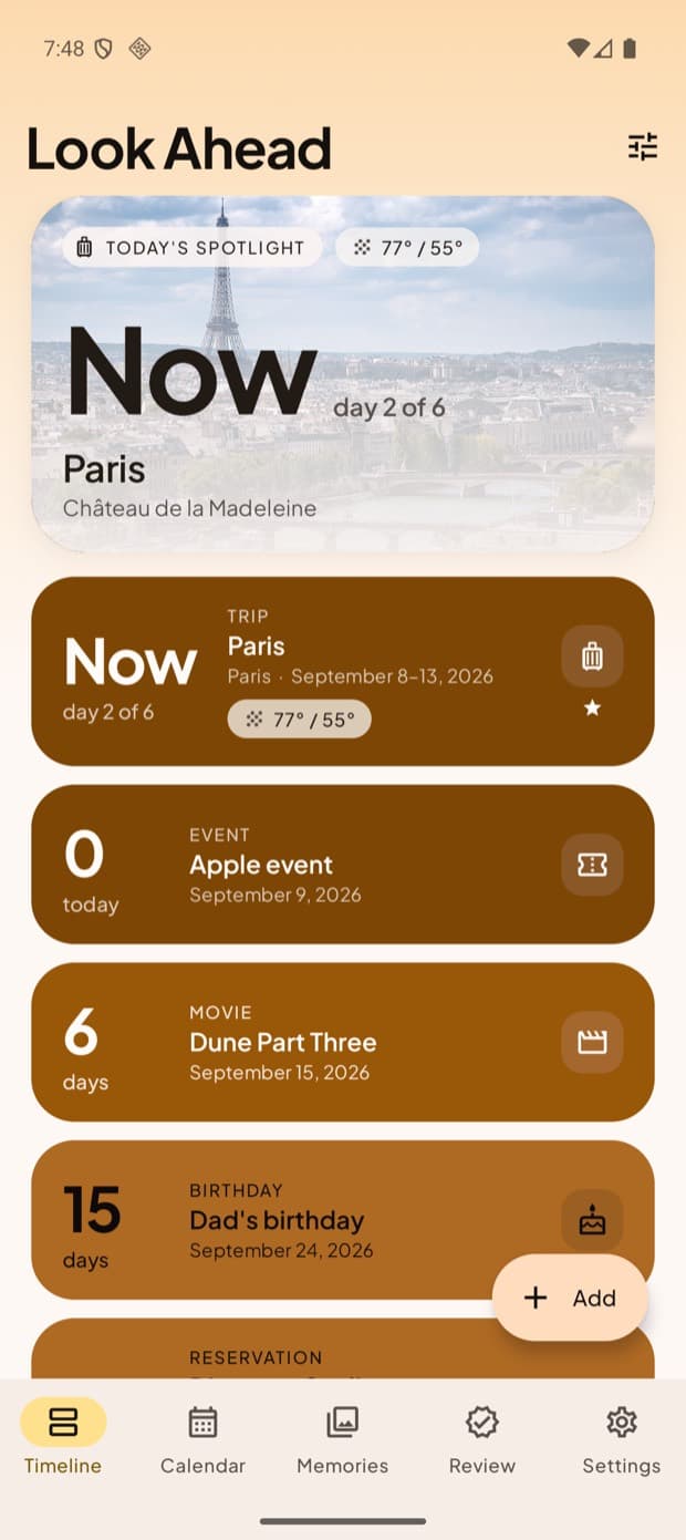
Timeline — Sunrise theme. Colour encodes time: near events saturated, far ones pale.
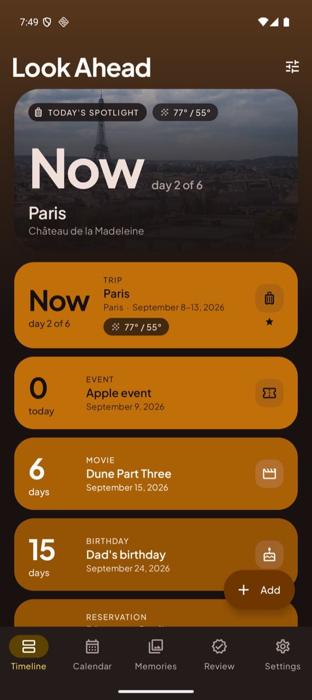
The same gradient in dark mode, contrast verified per theme.
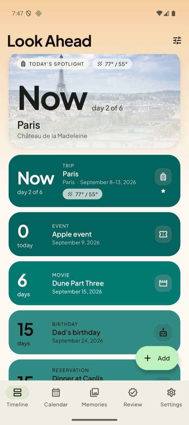
Forest — one of five themes, each driving the whole app.
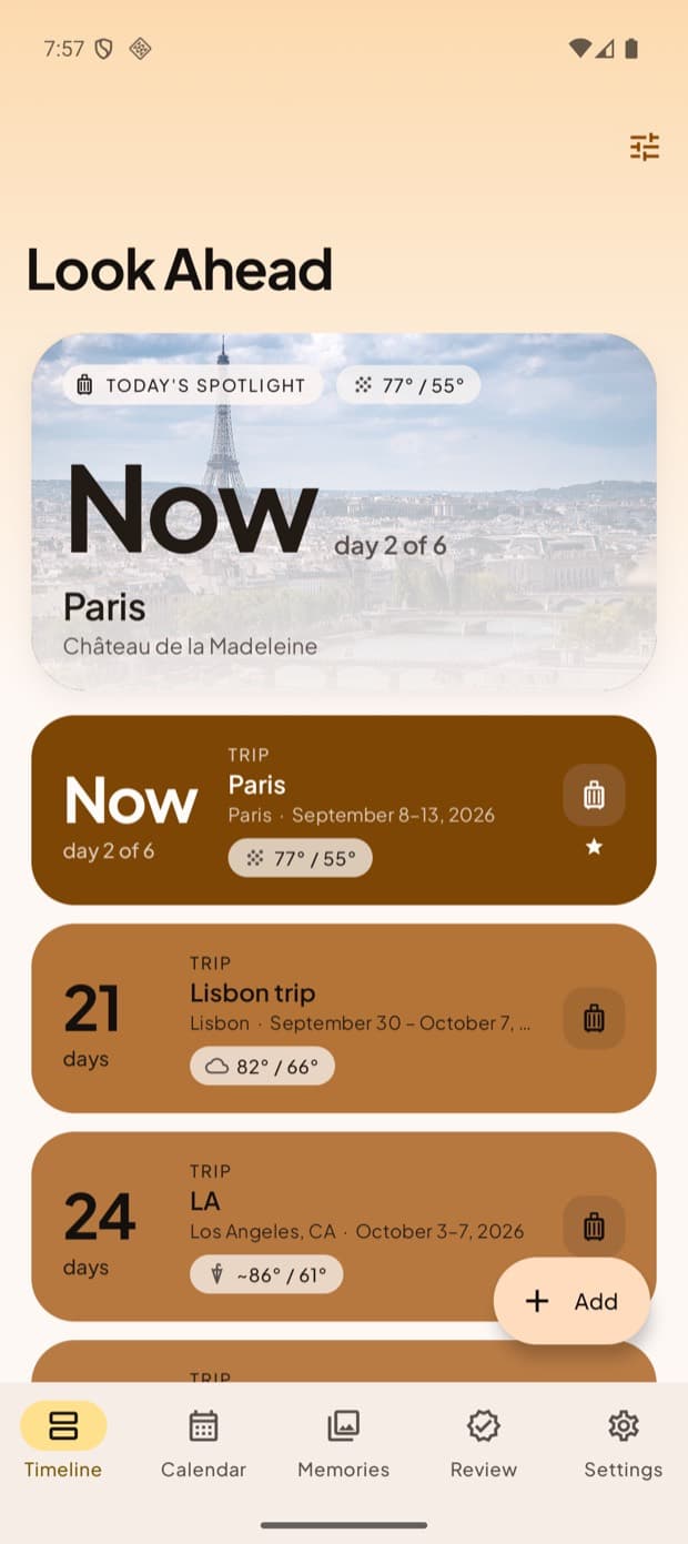
Timeline filtered to a single event type.
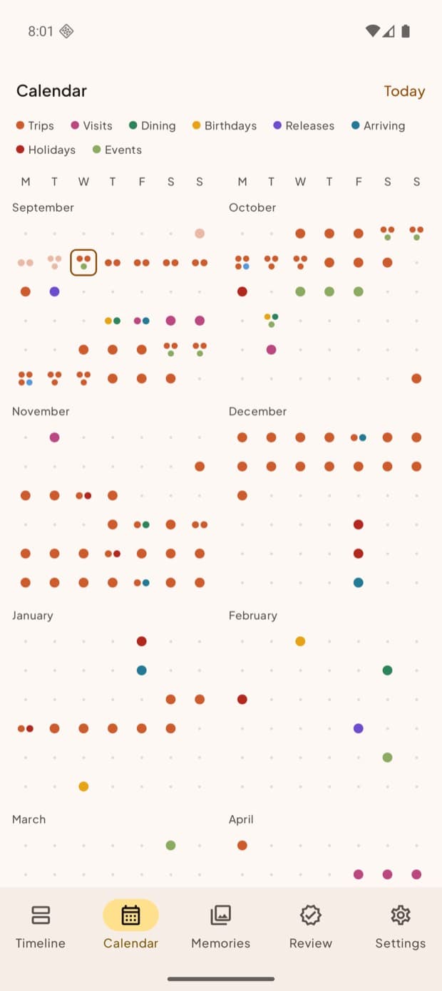
Calendar — a density heat-map. Here colour means category, not time.
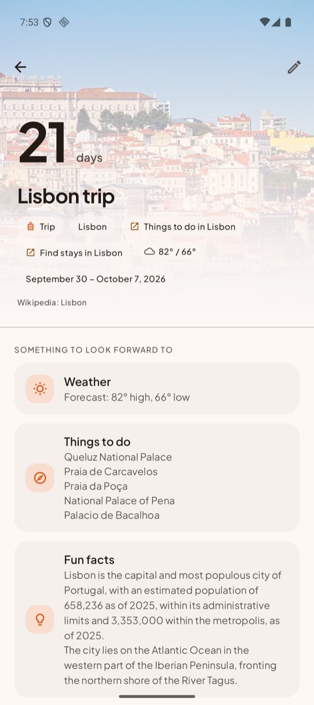
Trip detail, with weather and things to do from non-personal lookups.
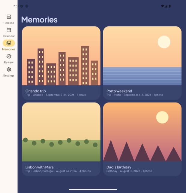
Memories — past events kept and photographed, not deleted.
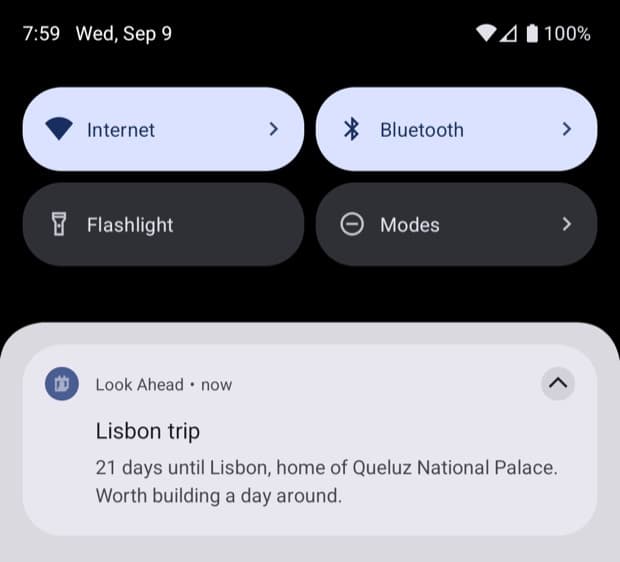
The daily nudge: one spotlight, written to suit how close the event is.
Scroll sideways →
Features
Timeline
The home surface. Everything you are anticipating in time order, each with a live countdown. Colour runs from rich and saturated to pale, so scrolling down feels like looking further into the future.
Calendar
A multi-month heat-map where each day carries category-coloured dots. Not a calendar app — a way to feel how much you have coming up at a glance.
Memories
Where past events go to be remembered rather than deleted. Attach photos and the app becomes reflection as well as anticipation.
Review
A confirm-first intake queue. The app detects candidate events from your calendar, but nothing reaches your timeline without your say-so.
Eight event types
Trips, visits, birthdays, reservations, releases, purchases, holidays, and a general type — each with its own identity in the system.
The daily nudge
A gentle notification rotates a spotlight through what is coming, with human-written copy that adapts to proximity: "one week to San Diego — time to sort the essentials".
Five themes, one gradient
Sunrise, Dusk, Forest, Mono and Ember each drive the entire app, including a continuous perceptual gradient interpolated in OKLab so the mid-tones never go muddy.
Foldable-aware
Built responsively for a Galaxy Z Fold — the layout adapts between the cover and inner screens. Two resizable home-screen widgets.
How it works
01The app scans your calendar for things worth anticipating and proposes them in Review.
02You confirm or dismiss. Nothing reaches the Timeline on its own.
03Confirmed events land with a live countdown, coloured by how far away they are.
04A daily nudge spotlights one of them with copy suited to how close it now is.
05Once the date passes it moves to Memories, where photos turn it into a keepsake.
Confirmation numbers, notes, photos and people's names never leave the device. Only non-personal lookup keys — a city, a date, a public title — go out, and only for enrichment like weather. This is enforced structurally: every outbound lookup passes through a single choke point, so a private detail cannot leak by accident. Four independent security reviews were run against that boundary.
Confirm-first intake
The app reads your calendar to find things worth anticipating, but it never auto-adds. Detection proposes; you dispose. What counts as worth looking forward to is not a judgement the app is entitled to make for you.
Colour means one thing per surface
An early version used colour to encode two different things across two tabs — a subtle inconsistency that made the whole system unlearnable. The fix was a deliberate split: on the Timeline colour means time; on the Calendar it means category. One rule per surface, applied without exception.
Restraint over features
The hardest calls were the ones not to build: no in-app booking, no becoming a full trip planner, no modules cluttering a clean surface. A half-working destination-soundtrack feature was cut after three honest attempts rather than shipped mediocre. A premium feel comes from what you leave out.
A matte finish that kept its depth
The most recent design pass added flat fills, a single soft shadow, hairline separation and a faint paper grain — achieved by softening finish while holding colour lightness byte-for-byte identical, so the surface changed without flattening the gradient underneath it.
How it was built
Design-first, always
Visual decisions were resolved in a design tool before any code was written — colour arcs, theme palettes, the matte spec — so the build had a spec to hit rather than inventing look-and-feel on the fly.
Self-contained specs
Each build session got a complete, standalone brief. The coding agent cannot see prior conversations, so every prompt had to teach it everything it needed from scratch.
Git as the safety net
Running an agent on auto-approve is only sane with version control. A commit at every working state means any wrong turn is one revert away.
Verify on the real device
The most instructive bug of the project — a nudge system that passed every unit test but produced nothing on the phone — was a regex quirk that only fails on Android's engine, not the JVM the tests ran on. Green tests are not a shipped feature. Verification happens on the device.
What I actually did
I am a product manager, not a full-time engineer. I do not hand-write the Kotlin. I make the product and design decisions, write the specs, and direct the build — Claude Design for the visual system, Claude Code for the implementation, with strategy and triage done conversationally in between. The judgement is the job: what to build, what to cut, and what good actually looks like.